
In a world full of illuminated advertising, it is no longer enough to simply be visible. How your brand is perceived is crucial.
Modern illuminated letters are now much more than just signage. They are a central component of your brand image and make a lasting first impression.
Through the targeted combination of corporate design, intelligent-led-technology-from-specialist-retailer-light-and-sign-gmbh/" class="kb-auto-link">light colour, brightness and uniform illumination, brands can be clearly differentiated and emotionally charged. This creates visibility with recognition value.
Further information can be found on our page about illuminated letters and profile letters.
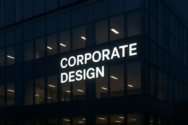
Making corporate design visible
Illuminated letters are one of the most visible forms of your corporate design. They act as a trademark and engage visitors emotionally even before they enter your company.
Important design factors are:
- Font and shape: clear typography looks modern and precise, while rounded shapes convey closeness and friendliness.
- Material and surface, acrylic, aluminium or stainless steel convey different values such as high quality, innovation or durability.
- Accurate colour reproduction, modern LED technology enables the precise implementation of your company colours for a consistent brand image.
A consistent brand image across all locations increases recognition and strengthens your brand in the long term.
Use light colour selectively and control emotions
Light has a direct effect on emotions. The chosen light colour subconsciously influences how your brand is perceived.
- Warm light colours such as gold, amber or warm white create trust, elegance and a sense of well-being.
- Cool or coloured light tones such as blue, green or red represent technology, dynamism and innovation.
- Accent colours add targeted highlights to logos, contours or individual letters.
A consistently used light colour becomes part of your brand identity and ensures high recognition.
Adjust brightness with finesse
Brightness is more than just a technical value. It determines whether your illuminated advertising is perceived as pleasant or annoying.
A well-thought-out lighting concept focuses on:
- automatic dimming in darkness
- location-dependent control for optimum visibility
- perfect readability without glare
Illuminated letters create a striking, high-quality and professional impression.
You can find more information under modern LED lighting solutions.
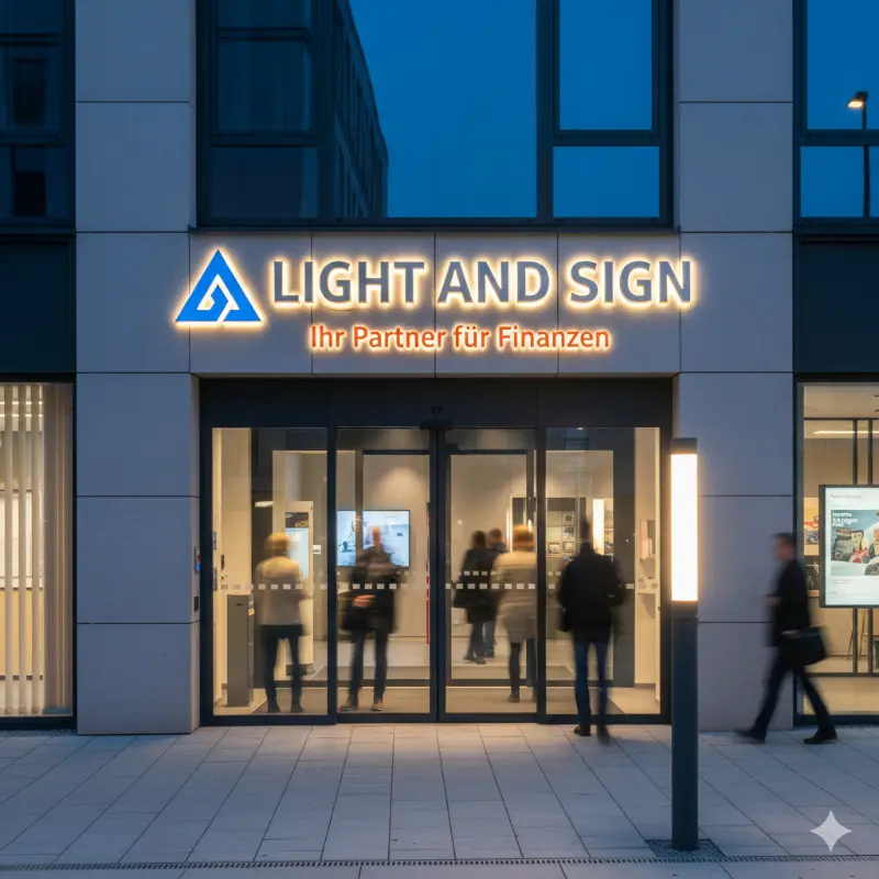
Uniform illumination as a quality feature
Uniform illumination is one of the most important features of high-quality illuminated advertising. It has a decisive influence on perceived quality.
Professionally illuminated illuminated letters are characterised by:
- no shadows
- no hotspots
- no colour differences
- a calm, even surface of light
Light & Sign works with precisely calibrated LED modules and high-quality lenses to illuminate every surface cleanly and brilliantly. The result is a presentation that inspires confidence and radiates quality.

Conclusion: Show your brand character with illuminated letters
If you want to stand out, you don’t need bright lights, but rather a well-thought-out overall concept.
The combination of design, light colour, brightness and illumination makes illuminated letters a real brand experience.
Light & Sign accompanies you from the initial idea to the final installation and ensures that your illuminated advertising is not only seen but also remembered.
Get advice now and get in touch.